Simplifying a Complex Color Matching Workflow for Time Pressured Painters
Role: UX/UI Designer
Project: Color module redesign
Client: BASF Coatings
Automotive painters lose money every time they waste seconds clicking through screens. For BASF's color matching software, those seconds were adding up to minutes, costing both painters and the company.
This project focused on redesigning the Color module, the most critical and most problematic part of a complex enterprise application used daily by automotive painters. The module includes two interconnected workflows (Scan and Mix) that help painters match the exact color of a car needing repair, compare formulas, and mix paint precisely.
Time: 2023

Finale Hero Image
The redesigned Scan experience focused on clarity, visual comparison and faster decision making.The Problem
Although the application was built for professional painters, the Color module relied on outdated UI, excessive page depth and system driven decision making that confused even experienced painters.
Painters are paid per job, not per hour, which means speed and clarity directly impact their income. However, the existing experience required too many clicks, forced users through a deeply linear workflow that made it difficult to pivot or recover and relied heavily on color match scores that didn’t always reflect real world accuracy.
Because of this:
New painters struggled to understand how to use the tool.
Experienced painters felt slowed down by unnecessary steps.
Critical decisions were being made by the system rather than the painter.
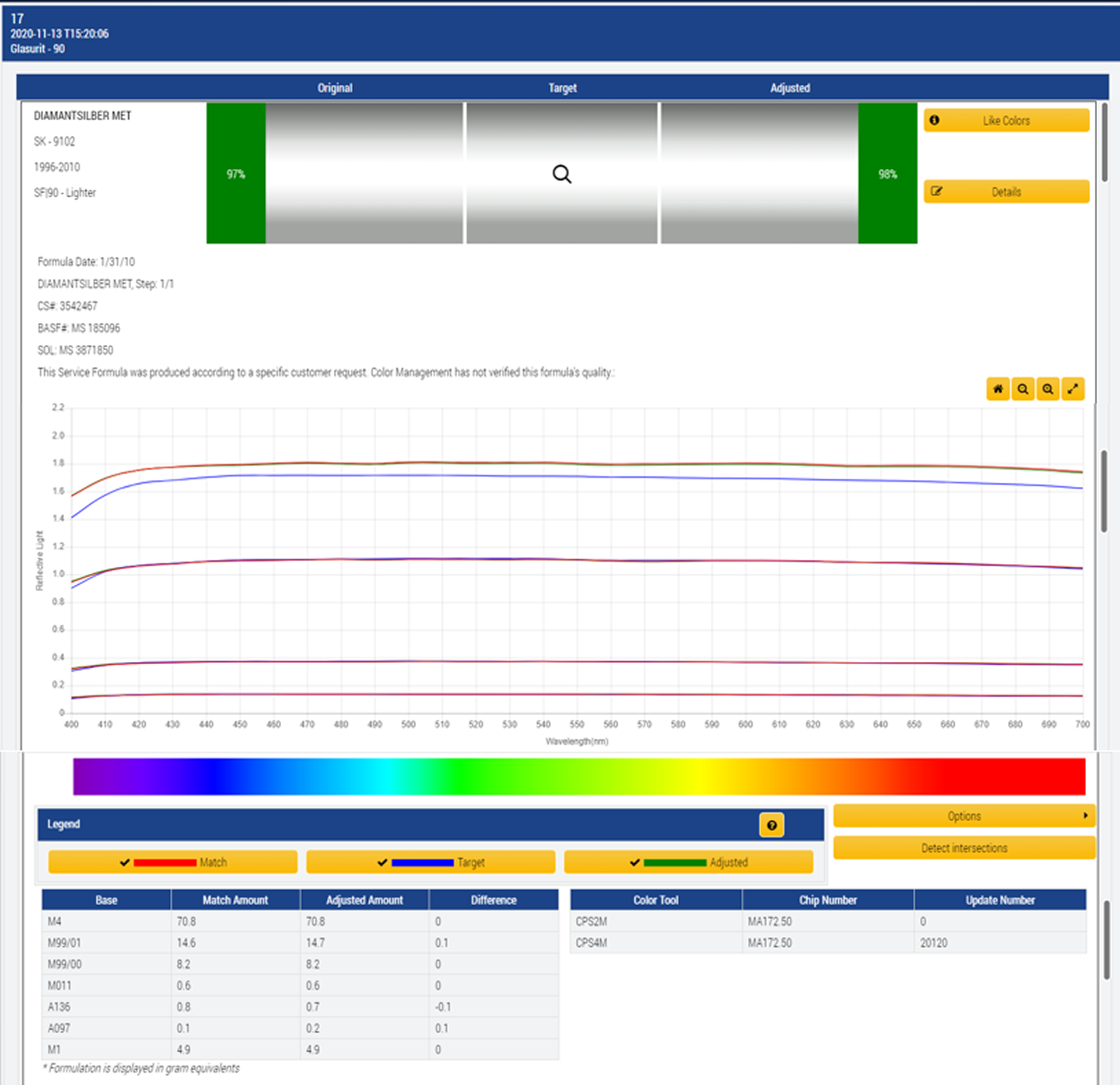
Before:
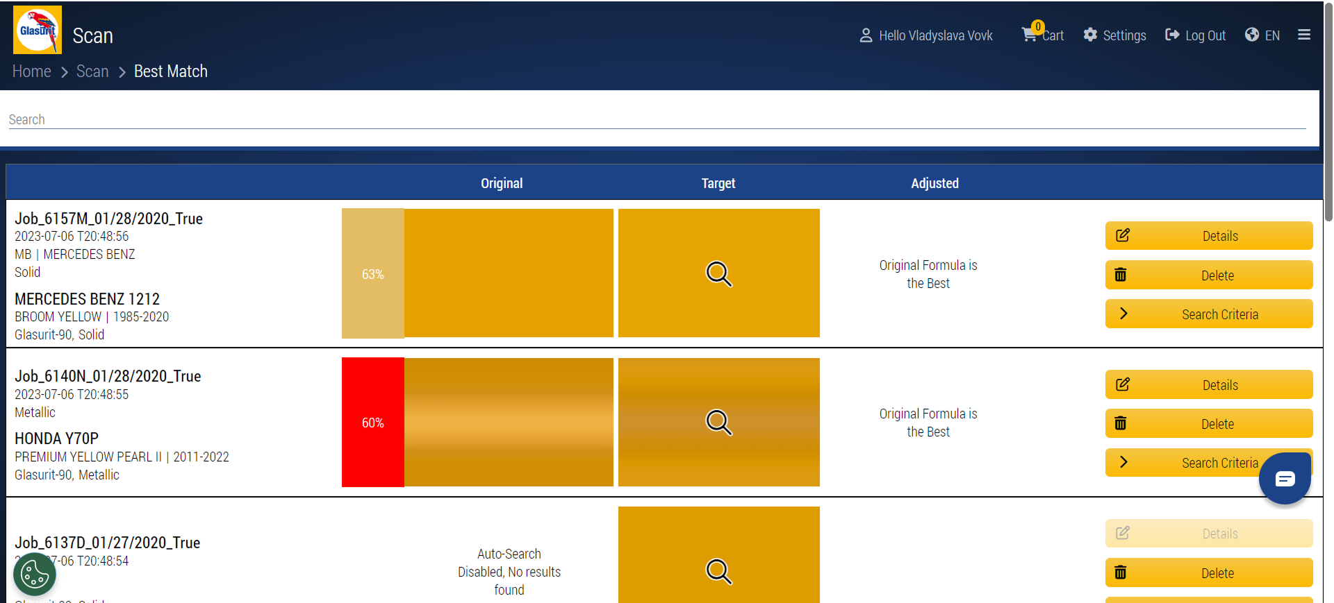
Caption: “Legacy Scan and Best Match screens overloaded users with competing information and system-driven confidence.”Users and Context
The primary users are automotive painters working in high and low volume body shops. While they have deep expertise in paint and color matching, many are not tech savvy and have little patience for complex software.
Key characteristics that influenced design decisions:
Speed matters more than perfection
They prefer fewer clicks and fewer screens
Painters trust the abstract system scores over their own visual judgment
Learning must happen in context, not in documentation
A deeper dive into user research is covered in a separate case study. This project focuses on how those insights were applied to design execution. Add link
My Role & Constraints
As the UX/UI designer on this project, I worked end-to-end across research synthesis, auditing, interaction design, layout, and system-level navigation improvements.
My responsibilities included:
Auditing the existing Scan and Mix workflows
Identifying usability and navigation breakdowns
Led interaction, layout, and information hierarchy redesigns
Introduced system-level navigation improvements
Contributing to the evolution of the design system
Constraints included:
Core functionality could not be removed
The solution needed to support both new and experienced painters
Changes had to integrate seamlessly with other product modules
Auditing the Existing Experience
Before designing solutions, I mapped the existing Scan → Mix workflow to understand where friction occurred.
The experience was deeply linear. Users were forced forward page by page with limited visibility into where they were in the process or how to pivot. Navigating often meant restarting entirely or relying on breadcrumbs, which increased cognitive load during an already complex task.
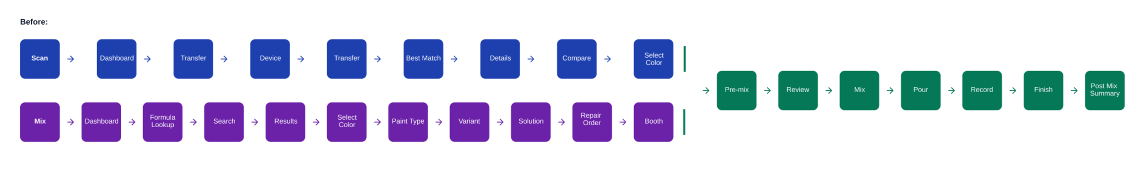
User Flow Before:
The before of the multi-page Mix flow.Part 1: Scan Redesign
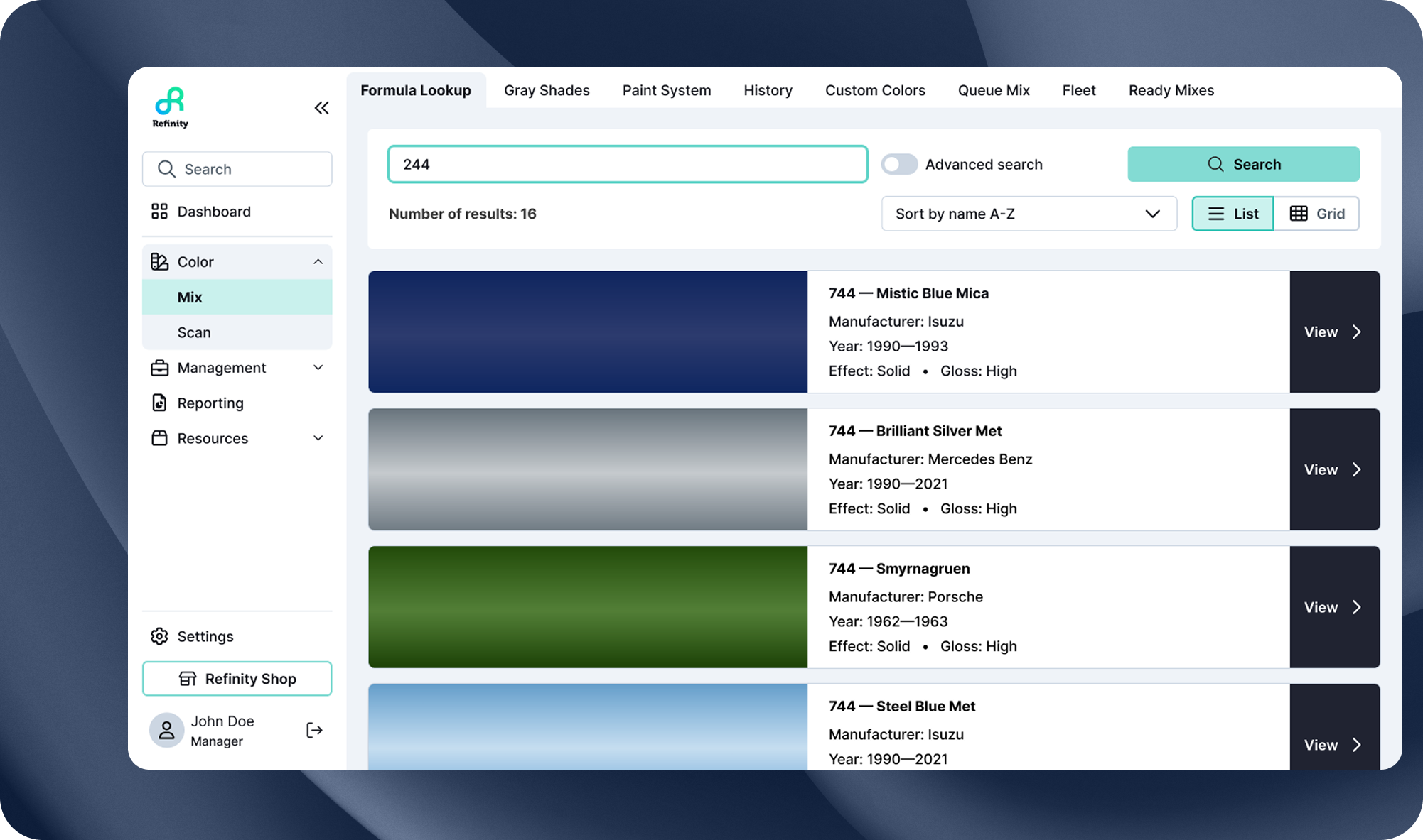
The Scan workflow is where painters upload their car scans and select which formula to use. This is the first critical decision point, and getting it right saves time and materials later in the Mix workflow.
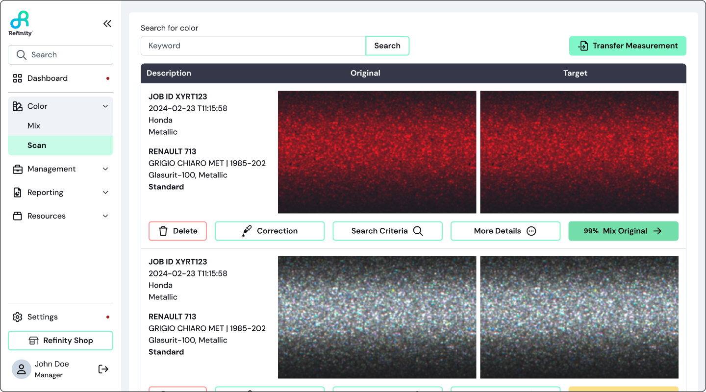
Rethinking “Best Match” Confidence
In the legacy experience, painters relied heavily on a percentage based match score even when it didn’t always reflect real world accuracy.
Rather than removing guidance entirely, I redesigned how confidence was communicated.
What changed:
Removed the percentage match indicator.
Retained the red / yellow / green traffic light system.
Encouraged painters to compare spectro graph lines directly to influence their choices.
This shift reduced blind trust in the system and reinforced painter expertise. When multiple options appeared “green”, painters were prompted to look deeper and make an informed decision instead of defaulting to a single percentage score.
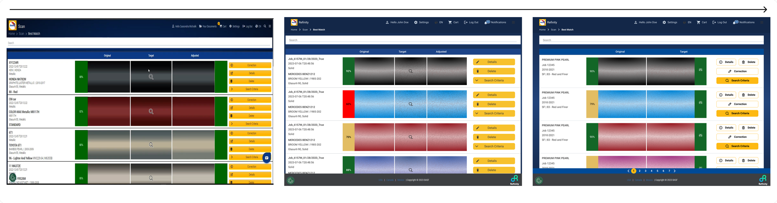
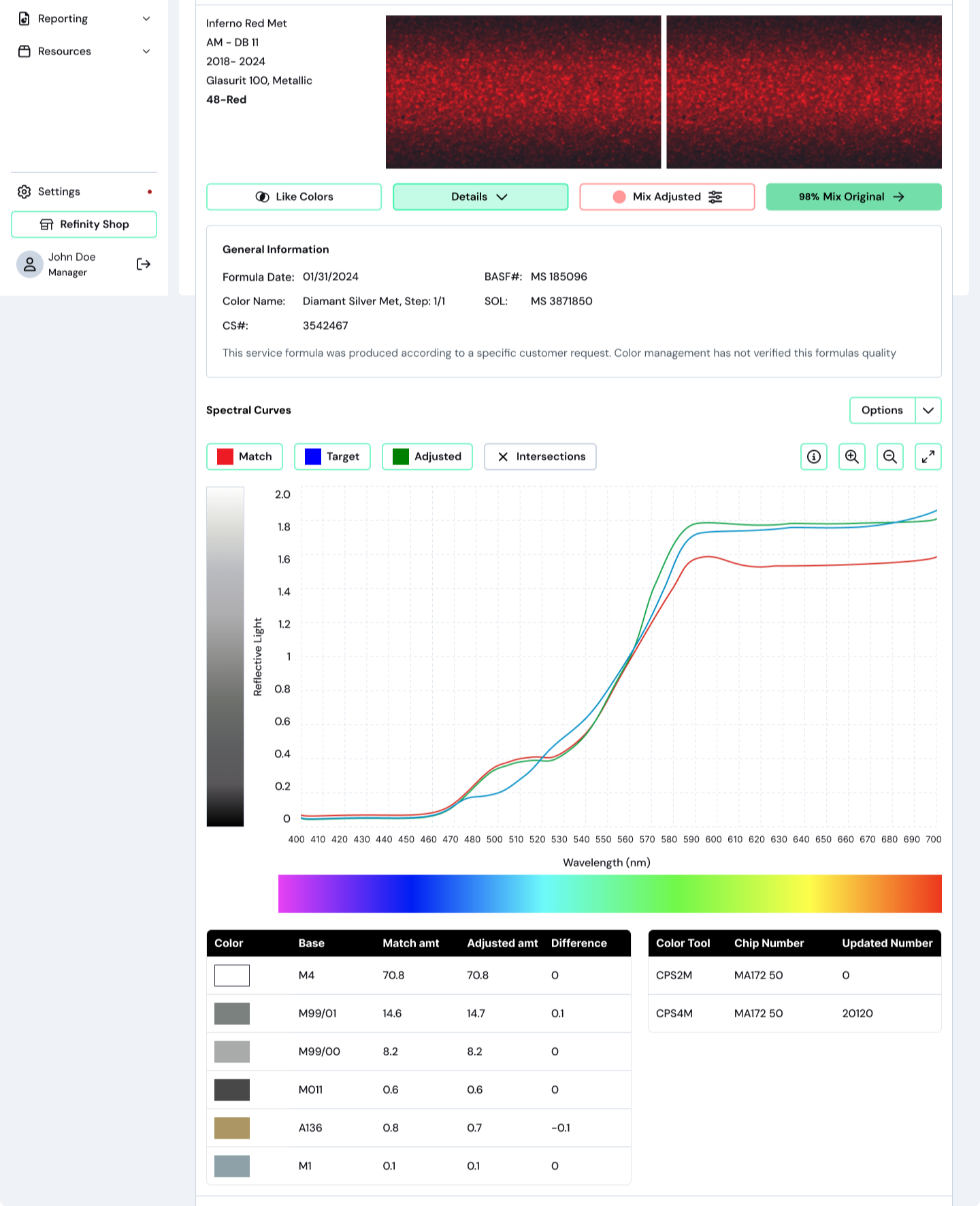
Before → After: Best Match
“Best Match redesigned to reduce cognitive load and encourage informed comparison."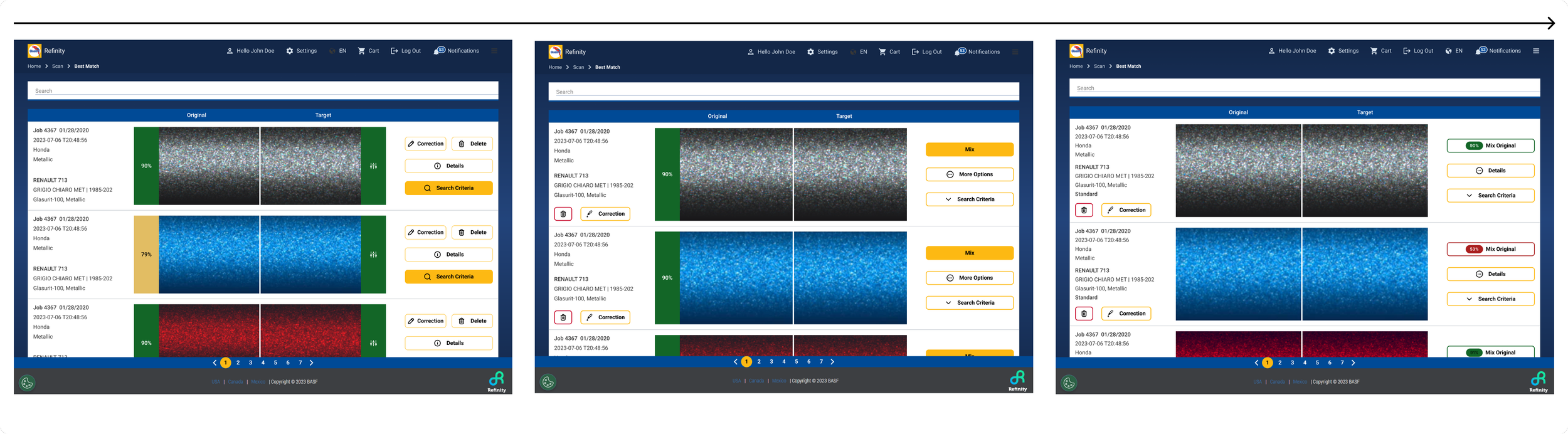
“Best Match redesigned to reduce cognitive load and encourage informed comparison."
Educating Through Design
Painters are taught how to read spectro graph lines when they first start the job, but once that training is over, the system doesn’t provide support, leaving them with no incentive to figure it out on their own.
To address this, I redesigned the spectro graph education directly within the Scan experience by:
Simplifying language
Clarifying visual hierarchy
Redrawing the instructional graphic
This allowed learning to happen exactly when it was needed, without breaking the workflow.
Before → After: Color Details
Spectro graph education redesigned to support learning in context.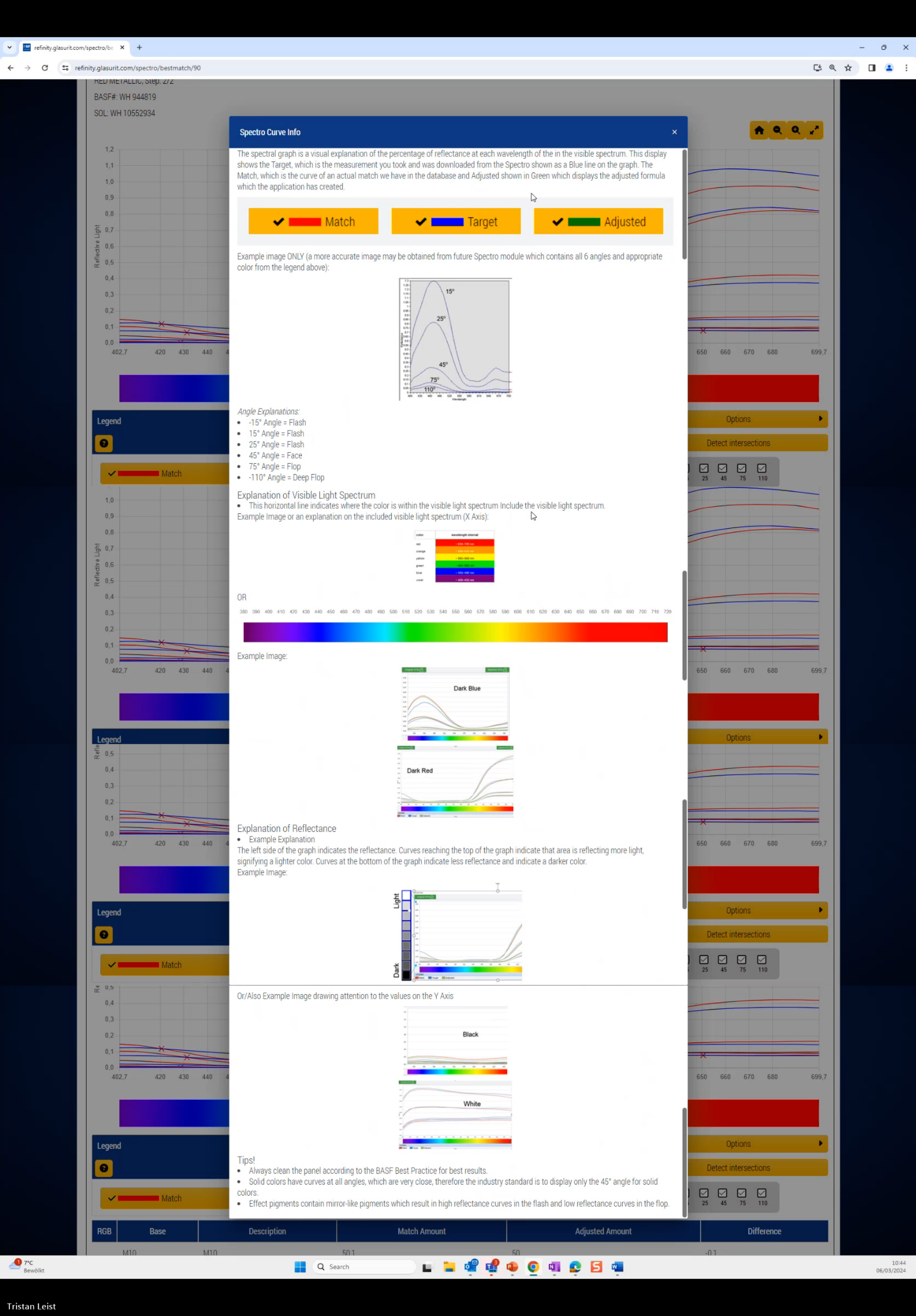
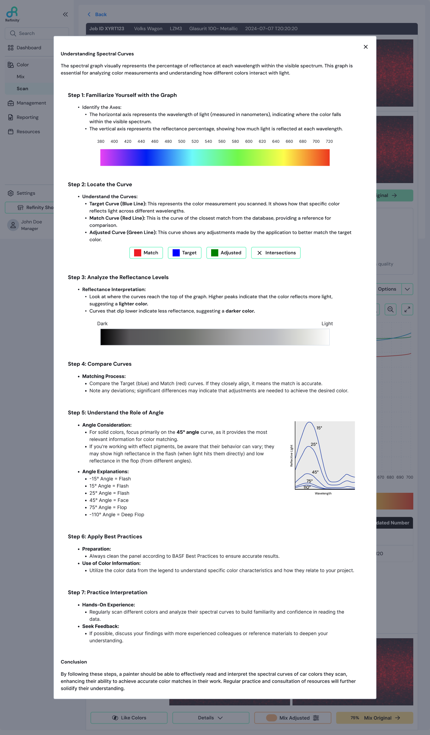
Before → After: Spectral Curve Info Modal
Spectro graph education redesigned to support learning in context.Part 2: Mix Redesign
Once a color match is selected, the Mix workflow guides painters through choosing paint line, variants, booth assignment, and repair order before they can actually mix the paint.
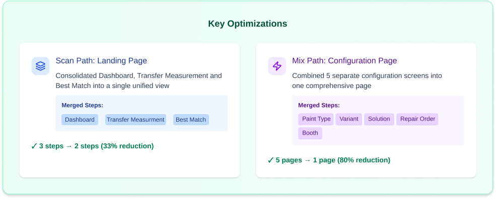
From Multi-Page Chaos to a Single Guided Flow
Previously, painters had to navigate multiple separate pages to complete these selections. Each page felt like a dead end with unclear paths forward or back.
I consolidated this into a single-page stepper that:
Clearly communicated progress
Allowed easy review and changes
Reduced unnecessary navigation
Created a faster path to mixing
The stepper preserved task complexity while making the process feel manageable and predictable.
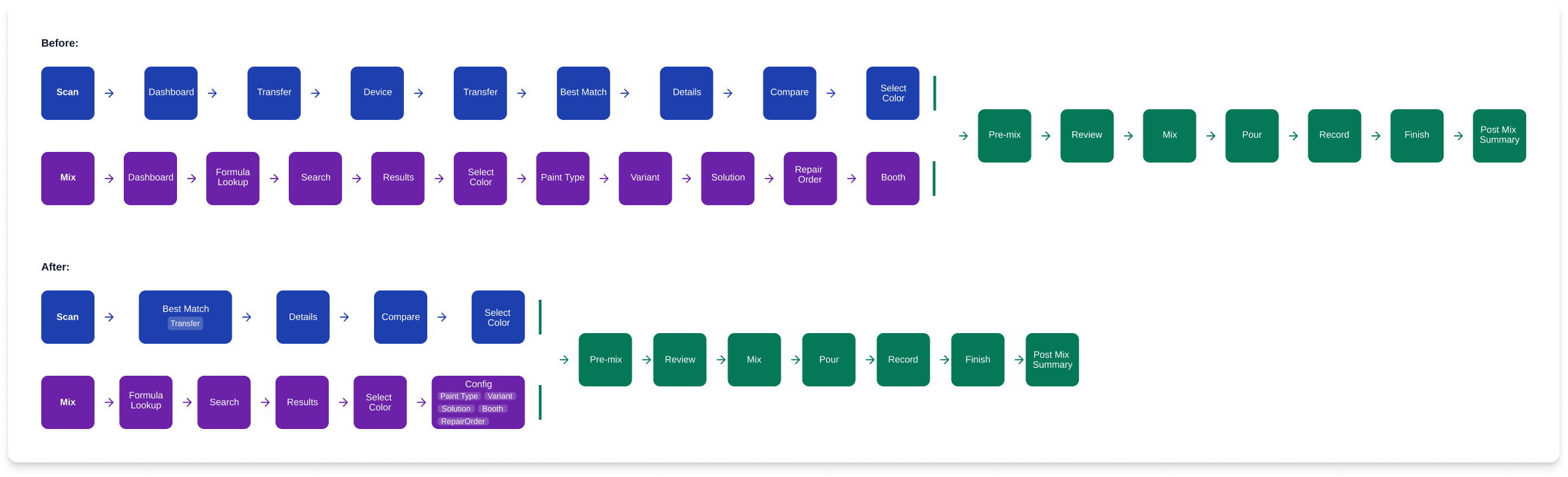
User Flow Before & After
Multi-page mix flow consolidated into a single guided stepper.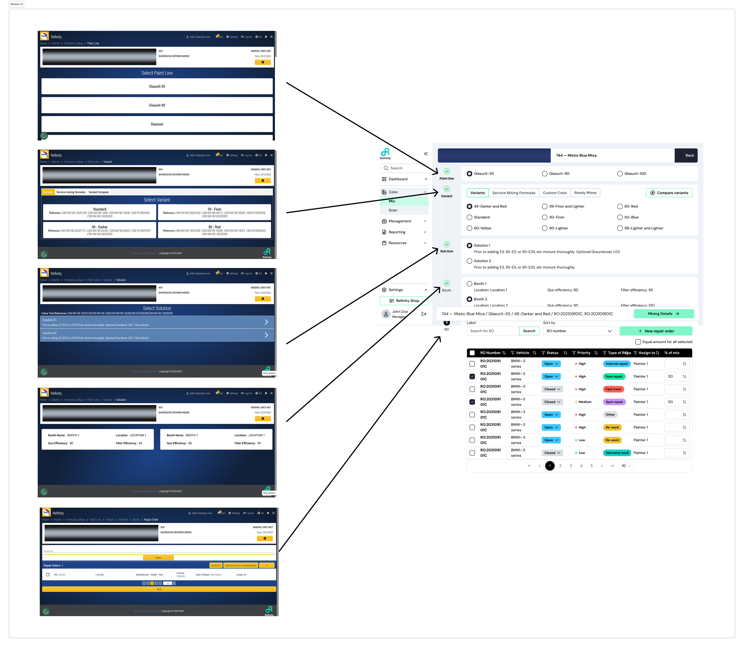
Old Multi-Page Flow → New Stepper
Multi-page mix flow consolidated into a single guided stepper.System-Level Improvements: Navigation
One of the biggest challenges wasn't isolated to Scan or Mix, it was the navigation system connecting all the Color module features: Scan, Formula Lookup, Queue Mix, Mix History, and the Mix interface itself.
The previous navigation model frequently trapped users in dead ends or forced them to restart tasks entirely. Breadcrumbs existed but didn't provide enough context or flexibility.
The solution:
A persistent left side main menu for primary modules
Top level tabs for secondary navigation within modules.
Always visible, regardless of where users were in the system.
This change dramatically improved task switching, reduced restart behavior and gave users a stronger mental model of the product. It was one of the highest impact improvements we made.
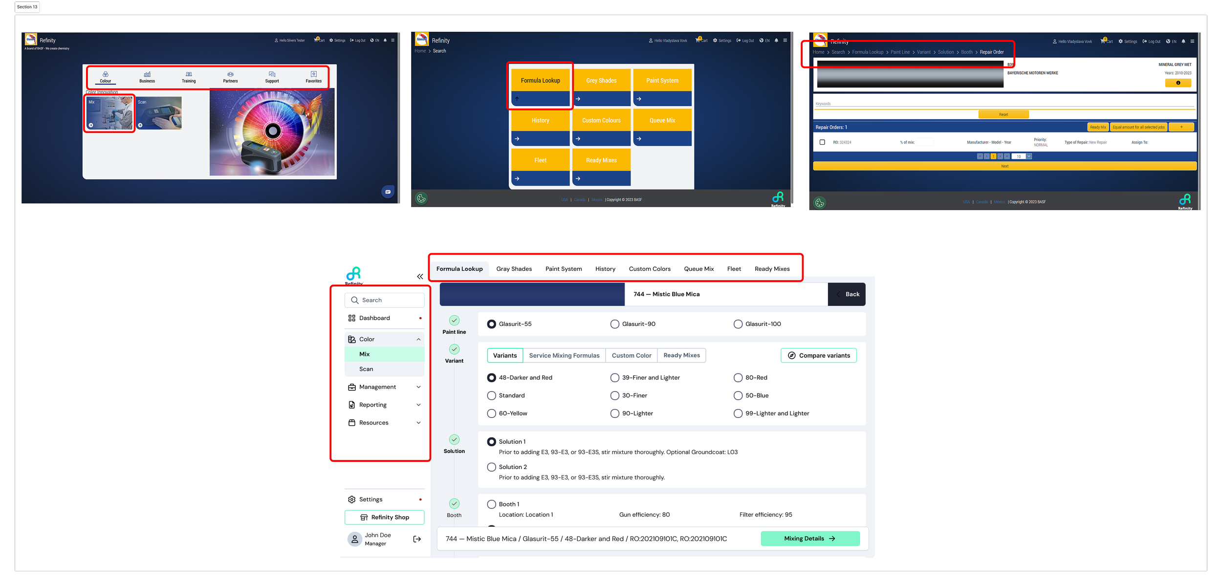
Before → After Navigation
Navigation redesigned to be persistent and accessible across the system.Outcome and Impact
The redesigned Color Module created a faster, clearer, and more modern experience while preserving the professional control painters expect.
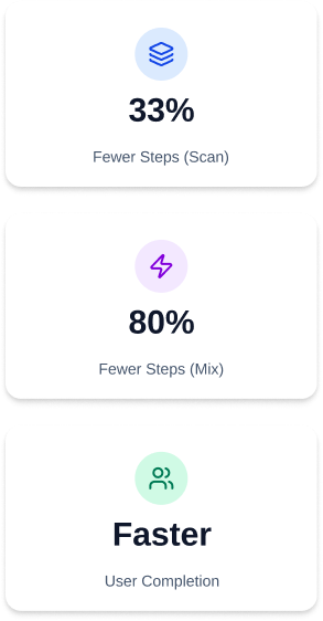
Key Outcomes:
57% reduction in click count across the Scan → Mix workflow.
32% Faster onboarding for new painters (reduced training time & comprehension).
2x Increase in confidence in match selection.
Created a scalable foundation for future features and design system growth.
Additionally, this project helped establish patterns and components that fed into a broader design system, improving consistency across BASF's digital products.
Reflections & Learnings
What I learned:
The biggest challenge was balancing the needs of new vs. experienced users. New painters needed guidance and structure, while experienced painters wanted speed and flexibility. The stepper and redesigned Best Match screen solved this by providing clear structure without forcing unnecessary steps on experts.
If I could do it again:
I'd spend more time early on mapping the mental models of different user segments. We learned midway through that shop managers and painters had very different expectations for how the Scan & Mix flow should work. Earlier research into these differences would have streamlined development.
The project not only met its goals but also set a new standard for BASF's digital offerings, prompting an extension of our collaboration to elevate the entire Refinity platform.